Kids Pick the President
UX/UI WEBSITE
I led the UI design for Kids Pick The President, an interactive educational website created by Nickelodeon that allowed children to participate in a non-scientific, entertainment-focused presidential poll. The initiative encouraged civic engagement among kids by giving them a platform to cast virtual ballots in the weeks leading up to the U.S. presidential election. From October 3-23, the site garnered participation from over 32,000 young users.
The project aimed to create a fun, engaging, and intuitive digital experience tailored to a younger audience while maintaining Nickelodeon's vibrant and playful brand identity. To achieve this, I worked within the constraints of existing brand guidelines and assets, ensuring visual consistency and brand alignment across the platform. My focus was on crafting an interactive user interface that resonated with the target demographic, promoting ease of use and fostering a sense of excitement about the voting process. This project exemplifies my ability to design engaging digital experiences for unique audiences while adhering to stringent brand standards and delivering measurable engagement outcomes.
ROLE - LEAD UI DESIGNER
CLIENT - NICKELODEON
YEAR - 2024

Unifying Dual Campaigns with a Flexible System
The main challenge of this project was designing a website that could temporarily support two campaigns while remaining future-proof. It needed to host both experiences at launch, then seamlessly transition into a standalone platform for Our World—a global initiative empowering kids to become active citizens—which also required a full redesign.
This meant bringing together two very different visual styles into a single, cohesive system without compromising either identity. At the same time, the project started with many unknowns: content was not yet defined, structure was unclear, and even the number of candidates could change. As a result, the design process focused heavily on creating a flexible, scalable framework that could adapt to evolving content while maintaining a clear and consistent user experience.
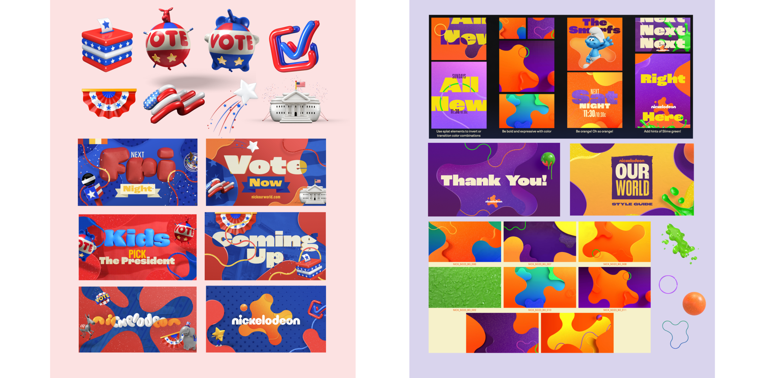
Creating a Cohesive Visual Bridge
High-fidelity design is where I iterated the most—exploring textures, fluid shapes, and transitions to create a seamless and engaging experience. Through this process, I developed a visual bridge between the two identities: using organic shapes and splats to blend the KPP palette (red and blue) into the Our World palette (purple and yellow). This allowed colors and forms to flow naturally across sections, creating a cohesive transition rather than an abrupt shift between two distinct styles.


